Twitter Sentiment Analysis of the Westside Road Diets in Summer 2017
Background: Lexicon-based Methods
After doing some research, I discovered that the most common method for performing sentiment analysis of text is through lexicon-based methods. A lexicon is a list of words that is scored in some way based on the emotional content of the word. The most simple lexicons score words in a binary way, such as postitive / negative (‘bing’ lexicon from Bing Lui and collaborators). Other lexicons may assign a numerical score to indicate not only the direction but the intensity of the emotion (‘afinn’ lexicon from Finn Arup Nielsen). Other lexicons will also go beyond positive / negative to assign words to a more specific emotion, such as surprise or anger (‘nrc’ lexicon from Saif Mohammad and Peter Turney).
Lexicons can be further categorized by the domain (such as community-specific lexicons for subreddits) and by the time period (a sentiment analysis of Shakespeare should not use a lexicon based on the modern use of the English language). If you are interested for these more unique lexicons, see this Stanford Repository.
I am going primarily use R. For an introduction to text analysis with R, I recommed reading “Text Mining with R”, which is freely available online. I am going to do all of the lexicon-based methods of sentiment analysis using the R package ‘Syuzhet’, which includes all of the main lexicons mentioned in the introduction. For an introduction to using Syuzhet, see this vignette.
Background: The Westside Road Diets of Summer 2017
For this assignment, I was particularly interested in looking at the sentiment of tweets related to LADOT. In the summer of 2017, LADOT rolled out a series of road diets on the following Westside streets of Los Angeles: Vista del Mar, Pershing Dr, Culver Blvd / Jefferson Blvd, and Venice Blvd. The road diets, which reduced the number of vehicular travel lanes for the purpose of improved safety, generated quite a reaction from the public. Faced with the backlash, Councilmember Mike Bonin made the decision to reverse nearly all the changes (they were all in his district). Below is just a sample of LA Times articles covering the events of that summer:
- Irate commuters threaten a lawsuit over narrowed streets in Playa del Rey (Jun 23, 2017)
- L.A. reverses course on lane reductions that ‘most people outright hated’ (Jul 27, 2017)
- L.A. has been sued again over traffic lane reductions in Playa del Rey (Aug 11, 2017)
- L.A. reworks another ‘road diet,’ restoring lanes in Playa Del Rey (Oct 3, 2017)
Scrape the Tweets
For any of the methods, we are going to need a data set to analyze. Although I will be performing the sentiment analysis in R, I am going to use Python to retrieve my twitter data for analysis. After playing around with the official Twitter API using the R package ‘rtweet,’ I wanted to explore a bit more beyond what the official API will let you do. The ‘twitterscraper’ python package seemed to be the way to go if I wanted to get historical twitter data for a particular search that goes beyond the 7-day limitation.
As I mentioned, for this particular analysis I was interested in trying to measure the sentiment related to LADOT and the road diets. When using the twitterscraper python package, I searched for any tweets involving the string ‘ladot’ and scaped the most recent 10k tweets.
##### Setup
from twitterscraper import query_tweets;
import fake_useragent;
import pandas as pd
import numpy as np

# Initial Query
list_of_tweets = query_tweets("ladot")

# Parse Query Results into df
tweet_data = []
for tweet in list_of_tweets:
    tweet_data.append([tweet.user,
                       tweet.id,
                       tweet.timestamp,
                       tweet.fullname,
                       tweet.text,
                       tweet.replies,
                       tweet.retweets,
                       tweet.likes])
tweet_df = pd.DataFrame(tweet_data)
tweet_df.columns = ['user','id','timestamp','fullname','text','replies','retweets','likes']

# Write the resulting df to a csv file for later analysis
tweet_df.to_csv("twitterscraper_venice_data.csv")
Analyze the Tweets & Plot
As I mentioned, although I did my twitter scraping using Python, I did the rest of my analysis using R’s syuzhet package. I calculated the sentiment scores and combined them all into one dataframe, and plotted on a timeline. After playing around with some of the time grouping intervals, I settled on summing the counts of tweets by 2 weeks (1 week was too noisy, while a month obscured the real variation in twitter activity). The 10k tweets ended up going back to late 2015, so I had a good year of baseline data on twitter activity related to LADOT.
I ran the 10k tweets trhough the syuzhet package to get the scores from the three different lexicons (nrc, bing, afinn). The Bing and Afinn lexicons produce a score that also indicates the level of intensity: a high negative value indicates a highly negative tweet and vise versa.
library(syuzhet)
library(ggplot2)
library(dplyr)
library(lubridate) # with_tz function
library(reshape2) # with melt() function
library(scales) # with date_breaks() function
library(tidyr)

### Data Prep
# Load Data
dot_df <- read.csv('C:/Users/Tim/Documents/GitHub/twitter-exploration/twitterscraper_dot_data.csv')

# Clean
dot_df$text <- sapply(dot_df$text,function(row) iconv(row, "latin1", "ASCII", sub=""))

# Calculate Sentiment Scores and Append to df
bing_sentiment <- get_sentiment(dot_df$text, method="bing")
afinn_sentiment <- get_sentiment(dot_df$text, method="afinn")
nrc_sentiment <- get_nrc_sentiment(dot_df$text)
tweets <- cbind(dot_df, nrc_sentiment, bing_sentiment, afinn_sentiment)

# Bing & Afinn Lexicons: Separate Positive / Absolute value of negative scores
tweets <- tweets %>%
  mutate(
    bing.pos = if_else(bing_sentiment > 0, bing_sentiment, as.integer(0)),
    bing.neg = if_else(bing_sentiment < 0, abs(bing_sentiment), as.integer(0))
  ) %>%
  mutate(
    afinn.pos = if_else(afinn_sentiment > 0, afinn_sentiment, as.integer(0)),
    afinn.neg = if_else(afinn_sentiment < 0, abs(afinn_sentiment), as.integer(0))
  )

### Sentiment Over Time
# Calculate Sentiment over Time
tweets$timestamp <- with_tz(ymd_hms(tweets$timestamp), "America/Chicago")
monthlysentiment <- tweets %>%
  # Group by Month
  group_by(timestamp = cut(timestamp, breaks="2 weeks")) %>%
  # For each month, sum totals of each emotion
  summarise(nrc.neg.sum = sum(negative),
            nrc.pos.sum = sum(positive),
            bing.neg.sum = sum(bing.neg),
            bing.pos.sum = sum(bing.pos),
            afinn.pos.sum = sum(afinn.pos),
            affin.neg.sum = sum(afinn.neg)) %>%
  # remove first/last (incomplete) months
  slice(3:n()-2) %>%
  # then Use melt to flatten table
  melt
names(monthlysentiment) <- c("month", "sentiment", "count")

# Plot Sentiment over Time
ggplot(data = monthlysentiment, aes(x = as.Date(month), y = count, group = sentiment)) +
  geom_line(size = 1, alpha = 0.7, aes(color = sentiment)) +
  ylim(0, NA) +
  theme(legend.title=element_blank(), axis.title.x = element_blank()) +
  scale_x_date(breaks = date_breaks("3 months"),
               labels = date_format("%Y-%b")) +
  # VdM Restriped
  geom_vline(aes(xintercept = as.numeric(as.Date("2017-05-26"))),
             linetype=4, col = "black") +
  annotate("text",x = as.Date("2017-05-26"),y=300, label= "VdM Restriped\n", size=3, angle=90) +
  # VdM Reversal Announced
  geom_vline(aes(xintercept = as.numeric(as.Date("2017-07-26"))),
             linetype=4, col = "black") +
  annotate("text",x = as.Date("2017-07-26"),y=100, label= "VdM Reversal Announced\n", size=3, angle=90) +
  # Full Reversal Announced w/ Garcetti
  geom_vline(aes(xintercept = as.numeric(as.Date("2017-10-18"))),
             linetype=4, col = "black") +
  annotate("text",x = as.Date("2017-10-18"),y=275, label= "Full PdR Reversal Announced\n", size=3, angle=90) +
  # Culver / Jefferson Westbound Travel Lane Reversal Announced
  geom_vline(aes(xintercept = as.numeric(as.Date("2017-10-2"))),
             linetype=4, col = "black") +
  annotate("text",x = as.Date("2017-10-26"),y=275, label= "Culver/Jefferson WBound Reversal\n", size=3, angle=90) +
  ylab("Sentiment Count") +
  ggtitle("Tweet Sentiments Involving 'LADOT'")
Running the above code for all three lexicons resulted in the chart below.
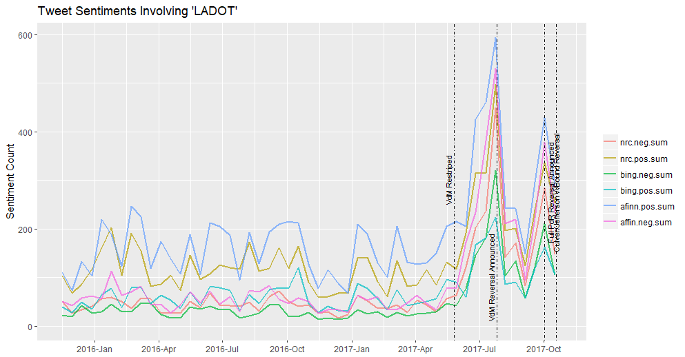
This chart shows how overall twitter activity related to LADOT correlated with the major announcements of the summer, some of which happened on twitter itself. I added lines to annotate these major events, such as when the project was implemented and when parts of it were reversed. You can see how the lines matched up almost perfectly to the peaks of twitter activity.
The first thing that struck me from looking at the graphic above was that the three lexicons did not always agree on whether the dominant emotion was positive or negative. For example, at the height of the twitterstorms, the Afinn and NRC lexicons generally showed that positive emotion on twitter was stronger than negative emotion. The Bing lexicon, in contrast, showed a cummulative negative emotion that outweighed positive emotions during the event.
I decided to look only at the results from the Bing lexicon.
### Sentiment Over Time
# Calculate Sentiment over Time
tweets$timestamp <- with_tz(ymd_hms(tweets$timestamp), "America/Chicago")
monthlysentiment <- tweets %>%
  # Group by Month
  group_by(timestamp = cut(timestamp, breaks="2 weeks")) %>%
  # For each month, sum totals of each emotion
  summarise(bing.neg.sum = sum(bing.neg),
            bing.pos.sum = sum(bing.pos)) %>%
  # remove first/last (incomplete) months
  slice(3:n()-2) %>%
  # then Use melt to flatten table
  melt
names(monthlysentiment) <- c("month", "sentiment", "count")

# Plot Sentiment over Time
ggplot(data = monthlysentiment, aes(x = as.Date(month), y = count, group = sentiment)) +
  geom_line(size = 1, alpha = 0.7, aes(color = sentiment)) +
  ylim(0, NA) +
  theme(legend.title=element_blank(), axis.title.x = element_blank()) +
  scale_x_date(breaks = date_breaks("3 months"),
               labels = date_format("%Y-%b")) +
  # VdM Restriped
  geom_vline(aes(xintercept = as.numeric(as.Date("2017-05-26"))),
             linetype=4, col = "black") +
  annotate("text",x = as.Date("2017-05-26"),y=300, label= "VdM Restriped\n", size=3, angle=90) +
  # VdM Reversal Announced
  geom_vline(aes(xintercept = as.numeric(as.Date("2017-07-26"))),
             linetype=4, col = "black") +
  annotate("text",x = as.Date("2017-07-26"),y=100, label= "VdM Reversal Announced\n", size=3, angle=90) +
  # Full Reversal Announced w/ Garcetti
  geom_vline(aes(xintercept = as.numeric(as.Date("2017-10-18"))),
             linetype=4, col = "black") +
  annotate("text",x = as.Date("2017-10-18"),y=275, label= "Full PdR Reversal Announced\n", size=3, angle=90) +
  # Culver / Jefferson Westbound Travel Lane Reversal Announced
  geom_vline(aes(xintercept = as.numeric(as.Date("2017-10-2"))),
             linetype=4, col = "black") +
  annotate("text",x = as.Date("2017-10-2"),y=275, label= "Culver/Jefferson WBound Reversal\n", size=3, angle=90) +
  ylab("Sentiment Count") +
  ggtitle("Tweet Sentiments Involving 'LADOT'")
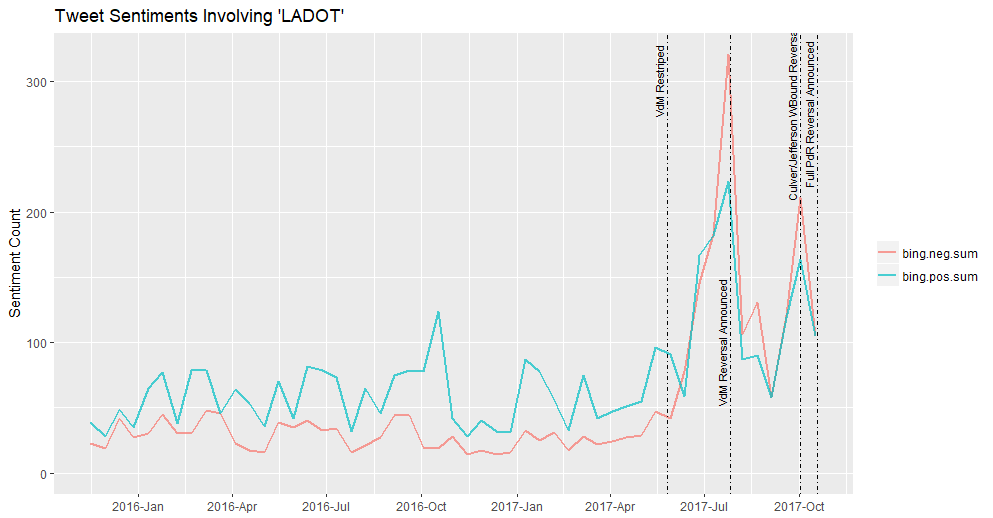
The output from this lexicon best matches my intuition about what what happening during the Westside projects. But wait - what is that small spike in traffic between 10/17/17 - 10/31/17? Let’s explore the positive twitter media bump:
# Let's explore one of the local peaks between 10/17 & 10/31
explore <- tweets %>%
  select(bing.pos, text,timestamp) %>%
  filter(timestamp > "2016-10-17" & timestamp < "2016-10-31")
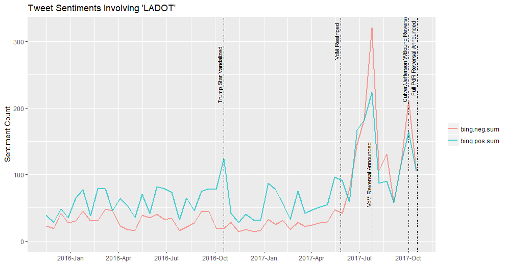
It turns out that someone masquerading as a LADOT employee took some heavy equipment in the night and smashed the Trump star on the Hollywood Walk of Fame. Ha! See below for the updated chart.
# Plot Sentiment over Time
ggplot(data = monthlysentiment, aes(x = as.Date(month), y = count, group = sentiment)) +
  geom_line(size = 1, alpha = 0.7, aes(color = sentiment)) +
  ylim(0, NA) +
  theme(legend.title=element_blank(), axis.title.x = element_blank()) +
  scale_x_date(breaks = date_breaks("3 months"),
               labels = date_format("%Y-%b")) +
  # VdM Restriped
  geom_vline(aes(xintercept = as.numeric(as.Date("2017-05-26"))),
             linetype=4, col = "black") +
  annotate("text",x = as.Date("2017-05-26"),y=300, label= "VdM Restriped\n", size=3, angle=90) +
  # VdM Reversal Announced
  geom_vline(aes(xintercept = as.numeric(as.Date("2017-07-26"))),
             linetype=4, col = "black") +
  annotate("text",x = as.Date("2017-07-26"),y=100, label= "VdM Reversal Announced\n", size=3, angle=90) +
  # Full Reversal Announced w/ Garcetti
  geom_vline(aes(xintercept = as.numeric(as.Date("2017-10-18"))),
             linetype=4, col = "black") +
  annotate("text",x = as.Date("2017-10-18"),y=275, label= "Full PdR Reversal Announced\n", size=3, angle=90) +
  # Culver / Jefferson Westbound Travel Lane Reversal Announced
  geom_vline(aes(xintercept = as.numeric(as.Date("2017-10-2"))),
             linetype=4, col = "black") +
  annotate("text",x = as.Date("2017-10-2"),y=275, label= "Culver/Jefferson WBound Reversal\n", size=3, angle=90) +
  # # Trump Star Vandalized
  geom_vline(aes(xintercept = as.numeric(as.Date("2016-10-17"))),
             linetype=4, col = "black") +
  annotate("text",x = as.Date("2016-10-17"),y=250, label= "Trump Star Vandalized\n", size=3, angle=90) +
  ylab("Sentiment Count") +
  ggtitle("Tweet Sentiments Involving 'LADOT'")
Future: Machine Learning Methods
Another method that I wanted to try included (this method using doc2vec)[https://www.r-bloggers.com/twitter-sentiment-analysis-with-machine-learning-in-r-using-doc2vec-approach/?utm_source=feedburner&utm_medium=email&utm_campaign=Feed%3A+RBloggers+%28R+bloggers%29]. The previous approach that the author took was a word-based approach, where the final ‘sentiment’ is calculated based on the difference of positive and negative words. The author updated the approach with a machine-learning method with a training set where the tweets were classified in their entirety. However, I lowered my expectations after reading some of the comments on the original blog post about it not performing any better than the lexicon-based methods. I’ll give the machine learning methods a shot in the future, but for now, I am satisfied with my lexicon-based work.