My LA Footprint
After coming across this Beneath Data blogpost, I thought it would be interesting to take a look at my own location data within Los Angeles to get a sense for how well I know different neighborhoods. Others have done the same, but I haven’t seen any with a Los Angeles map (yet). The big difference this time around is that I can take advantage of the GeoPandas library, which I am guessing was not yet available when the original blog post was written.
This tutorial will mostly follow the steps from the original Beneat Data blogpost, with some differences in the use of GeoPandas when appropriate.
Extract: Get your location history via Google takeout
- Go to https://www.google.com/settings/takeout and uncheck all services except “Location History.”
- When Google finishes creating the archive, download and unzip the file, which should be called “LocationHistory.json”
##### Setup
%matplotlib inline
import json
import pandas as pd
import geopandas as gpd
from shapely.geometry import Point
import pysal as ps
import matplotlib.pyplot as plt
import datetime
import folium
About Google Location History
Google provides your location history data in a json format that includes the following fields:
- timestamp, in Ms (“timestampMs”)
- latitude, multiplied by 10^7 (“latitudeE7”)
- longitude, multiplied by 10^7 (“longitudeE7”)
- accuracy score (“accuracy”): the confidence of Google’s guess in your location. I’m not sure about the scale of the confidence score.
- altitude (“altitude”)
- activitity (“activity”): Not present in every record, but if so, a dictionary that includes the following:
- timestamp (“timestampMS”): another timestamp value
- activity (“activity”): a dictionary that includes possible activities (“types”) along with Google’s confidence that you are doing each one (“confidence”). The types of activity include “Still”, “On_Foot”, “In_Vehicle”, “On_Bicycle”, “Unknown”, “Walking”, “Running”. The confidence scores do not add up to 100.
You can see below what the JSON data looks like:
# Load the file, print first five timestamps
with open('Takeout/Location_History/Location_History.json', 'r') as fh:
    data = json.loads(fh.read())

for i in range(0,5):
    print data['locations'][i]
{u'latitudeE7': 340515456, u'accuracy': 21, u'longitudeE7': -1182430915, u'altitude': 87, u'timestampMs': u'1499374838988'}
{u'latitudeE7': 340515456, u'accuracy': 21, u'longitudeE7': -1182430915, u'altitude': 87, u'timestampMs': u'1499374720149'}
{u'latitudeE7': 340515727, u'accuracy': 21, u'longitudeE7': -1182431029, u'altitude': 87, u'timestampMs': u'1499374478949'}
{u'latitudeE7': 340515727, u'accuracy': 21, u'longitudeE7': -1182431029, u'altitude': 87, u'timestampMs': u'1499374418822'}
{u'latitudeE7': 340515727, u'accuracy': 21, u'longitudeE7': -1182431029, u'altitude': 87, u'timestampMs': u'1499374320749'}
Load: Read the json file into a GeoDataFrame
For this piece of the project, I needed to transform the Google Location History JSON file into a usable GeoPandas GeoDataFrame.
with open('Takeout/Location_History/Location_History.json', 'r') as fh:
    data = json.loads(fh.read())

locations = data['locations']
print "The Google Location History JSON file contains {} points" .format(len(locations))

def generate_locations(locations):

    # Create a new dictionary ('loc') that will contain the transformed data
    # that we will use to create the new GeoDataFrame
    for loc in locations:

        # Create a shapely point object from the lat / lon coords
        loc['lon'] = loc['longitudeE7'] * 0.0000001
        loc['lat'] = loc['latitudeE7'] * 0.0000001
        loc['geometry'] = Point(loc['lon'], loc['lat'])

        # Convert timestamp from ms to s, create datetime object
        loc['timestampSec'] = int(loc['timestampMs']) * 0.001
        loc['datetime'] = datetime.datetime.fromtimestamp(loc['timestampSec']).strftime('%Y-%m-%d %H:%M:%S')

        # If activity is present, assign most likely activity to timestamp
        try:
            activities = loc['activity'][0]['activity']

            # Pick the activity with the highest probability
            maxConfidenceActivity = max(activities, key=lambda x:x['confidence'])
            loc['conf'] = maxConfidenceActivity['confidence']
            loc['activity'] = maxConfidenceActivity['type']

        except:
            loc['conf'] = None
            loc['activity'] = None

        yield loc

formatted_loc = generate_locations(locations)

google_loc = gpd.GeoDataFrame(generate_locations(locations))
google_loc = google_loc.drop(['velocity','latitudeE7','longitudeE7','timestampMs','heading'],axis=1)
google_loc.crs = {'init':'epsg:4326'}

# Let's take a peek at the resulting GeoDataFrame (focusing on those GPS timestamps where Google determined I was cycling)
google_loc[google_loc['activity'] == 'ON_BICYCLE'].head()
The Google Location History JSON file contains 193047 points
| accuracy | activity | altitude | conf | datetime | geometry | lat | lon | timestampSec | |
|---|---|---|---|---|---|---|---|---|---|
| 1113 | 29 | ON_BICYCLE | 130.0 | 75.0 | 2017-07-05 14:00:08 | POINT (-118.2403263 34.0543778) | 34.054378 | -118.240326 | 1.499288e+09 |
| 1919 | 5 | ON_BICYCLE | 62.0 | 75.0 | 2017-07-04 21:46:58 | POINT (-118.2364698 34.061805) | 34.061805 | -118.236470 | 1.499230e+09 |
| 1927 | 9 | ON_BICYCLE | 55.0 | 75.0 | 2017-07-04 21:30:10 | POINT (-118.2319688 34.0586363) | 34.058636 | -118.231969 | 1.499229e+09 |
| 2301 | 3 | ON_BICYCLE | 47.0 | 75.0 | 2017-07-04 19:31:24 | POINT (-118.2374922 34.0506868) | 34.050687 | -118.237492 | 1.499222e+09 |
| 2458 | 10 | ON_BICYCLE | 58.0 | 75.0 | 2017-07-04 18:44:43 | POINT (-118.2367696 34.0458967) | 34.045897 | -118.236770 | 1.499219e+09 |
Let’s do a bit of exploratory analysis, beginning with the amount of time spent doing each of the various activity states.
# Calculate the percentage of time spent doing each activity
activity_percent = (google_loc['activity'].value_counts() / google_loc['activity'].value_counts().sum())

# Create a bar chart showing the percentage of time spent doing each activity
activity_chart = activity_percent.sort_values(ascending=False).plot(kind='bar', title='Count of Timestamps for each Activity', figsize=(15,10), fontsize=12)
activity_chart.set_xlabel("Activity", fontsize=12)
activity_chart.set_ylabel("Percentage of Time", fontsize=12)
plt.show()
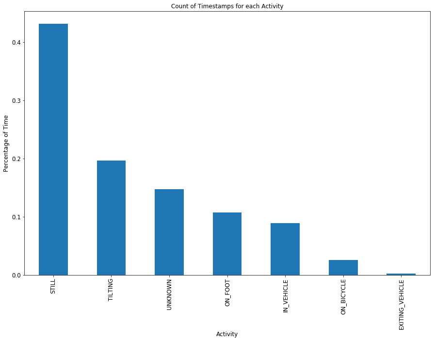
Insight #1: I am a tilter.
I am not sure what the activity state ‘TILTING’ refers to, but apparently I am engaged in it nearly 20 percent of the time. About 10 percent of the time I am on foot, and roughly 2% of the time I am on my bicycle. Of note to those who say nobody in LA walks, I spent more time in LA on foot than I did in a vehicle. I should add that I do not own a vehicle, so the “IN_VEHICLE” time is likely on the bus.
Transform: Bring in the Neighborhoods and perform Spatial Join
I’m interested in looking at my location history within neighborhoods of LA. The best source for this data is the LA Times Mapping L.A. project, which provides data for LA County neighborhoods and LA city neighborhoods in KML / SHP / JSON formats. I went ahead and downloaded the LA city neighborhoods in the shapefile format. I then spatially join my google location GeoDataFrame with the LA neighborhoods GeoDataFrame, which will automatically filter out all the location data that is outside the City of LA.
After joining the shapefile and converting the units into the percentage of time spent in each neighborhood, I can quickly plot a histogram to show this distribution.
# Read the shapefile
la_neighborhoods = gpd.read_file('la_neighborhoods/la_city.shp')

# Execute spatial join: all points within LA Neighborhoods
la_loc = gpd.sjoin(google_loc, la_neighborhoods, how='inner', op='intersects')

# Calculate the percentage of time spent in each LA neighborhood & Join to spatial dataframe
neighborhood_percent = (la_loc['Name'].value_counts(dropna=False) / la_loc['Name'].value_counts().sum()).reset_index()
neighborhood_percent.columns = ['Name','Percent']

# Clean up the resulting dataframe
la_neighborhoods = la_neighborhoods.merge(neighborhood_percent, how='left', on='Name')
la_neighborhoods = la_neighborhoods.drop('Descriptio', axis=1)

# Plot the bar chart
la_neighborhoods_pct = la_neighborhoods[la_neighborhoods['Percent'] > .008]
la_neighborhoods_pct = la_neighborhoods_pct.set_index('Name')
barchart = la_neighborhoods_pct['Percent'].sort_values(ascending=False).plot(kind='bar', title='Percent of Time Spent in Each LA Neighborhood', figsize=(15,10), fontsize=12)
barchart.set_xlabel("LA Neighborhood", fontsize=12)
barchart.set_ylabel("Percent of Last Year Spent in the Neighborhood", fontsize=12)
plt.show()
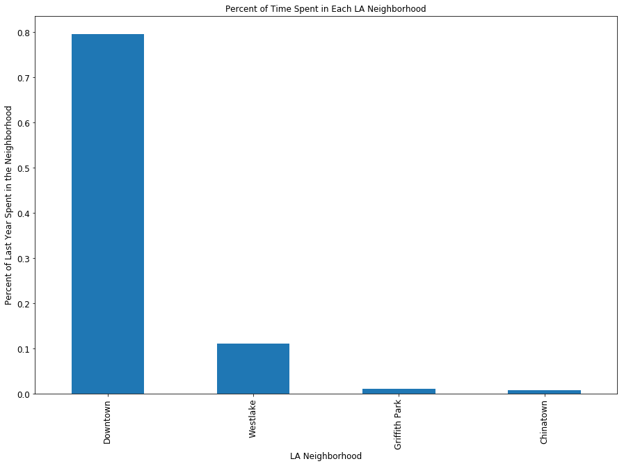
Insight #2: I spent quite a bit of time last year in downtown Los Angeles.
Talk about a skewed distribution! Of the time that I spent in Los Angeles last year (remember, we subsetted out GPS locations that were outside LA through the spatial join), roughly 80 percent of it was spent in downtown Los Angeles. However, the histogram should not be that surprising, since I both live and work downtown. Given that I’m sleeping roughly 7 hours a night and at work roughly 9 hours each day, it makes sense that such a large chunk of my time is spent in the downtown area. It also doesnt help that downtown has plenty of places to eat and enjoy happy hours, and a good chunck of my LA friends work downtown, so I end up spending quite a bit of time outside of work / home downtown.
The location with the second most time spent is Westlake, where I moved this year (so I expect the proportion of time spent in this neighborhood to grow over the next year).
Map: LA Neighborhood Time Choropleth
A friend suggested that a dot density map would probably be the most appriate form of cartography for this exercise. However, I wanted to take advantage of the folium python package, which unfortunately doesn’t yet include a dot density map overlay (and it might not look too pretty on top of leaflet tiles). Instead, I used the choropleth function within the folium package, mapping the percentage of time spent in each neighborhood.
Understanding the bar chart above, I knew that if I used the ‘Equal Interval’ classification scheme I would see downtown colored red and everything else yellow. I already know that I spent the largest chunk of time in the downtown area. However, I wanted the map to further distinguish between neighborhoods that I spent at least some time in versus those that I really spent no time in at all. I therefore went with the ‘Quantiles’ classification scheme. You can see below that Westlake / MacArthur Park, Los Feliz, Hollywood, K-town, Griffith Park, and LAX really pop out.
# Create LA Basemap specifying map center, zoom level, and using default openstreetmap tiles
la_basemap = folium.Map([34.047677, -118.3073917], tiles='Stamen Toner', zoom_start=11)

# Choropleth function adapted from code via Andrew Gaidus
# at http://andrewgaidus.com/leaflet_webmaps_python/
def add_choropleth(mapobj, gdf, id_field, value_field, fill_color = 'YlOrRd', fill_opacity = 0.6,
                    line_opacity = 0.2, num_classes = 6, classifier = 'Quantiles'):

    #Allow for 3 Pysal map classifiers to display data
    #Generate list of breakpoints using specified classification scheme. List of breakpoint will be input to choropleth function
    if classifier == 'Fisher_Jenks':
        threshold_scale=ps.esda.mapclassify.Fisher_Jenks(gdf[value_field], k = num_classes).bins.tolist()
    if classifier == 'Equal_Interval':
        threshold_scale=ps.esda.mapclassify.Equal_Interval(gdf[value_field], k = num_classes).bins.tolist()
    if classifier == 'Quantiles':
        threshold_scale=ps.esda.mapclassify.Quantiles(gdf[value_field], k = num_classes).bins.tolist()

    #Call Folium choropleth function, specifying the geometry as a the WGS84 dataframe converted to GeoJSON, the data as
    #the GeoDataFrame, the columns as the user-specified id field and and value field.
    #key_on field refers to the id field within the GeoJSON string
    mapobj.choropleth(
                geo_str = gdf.to_json(),
                data = gdf,
                columns = [id_field, value_field],
                key_on = 'feature.properties.{}'.format(id_field),
                fill_color = fill_color,
                fill_opacity = fill_opacity,
                line_opacity = line_opacity,
                threshold_scale = threshold_scale
                )
    return mapobj

la_google_history = add_choropleth(la_basemap, la_neighborhoods, "Name", "Percent")

la_google_history
Insight #3: When I was not downtown, I was not far from downtown.
With the exception of LAX, the other neighborhoods that I spent quite a bit of time in were just a few stops off any of the major rail lines. Westlake, Los Feliz, and K-town are all off the red/purple line. Chinatown, Little Tokyo (also downtown), and Boyle Heights are all off the Gold line. What about Griffith Park?
Let’s look into that a bit more with another map!
# Create new LA Basemap specifying map center, zoom level, and using Stamen Terrain tiles
griffith_map = folium.Map([34.109279, -118.266087], tiles='Stamen Terrain', zoom_start=13)

# Resurrect the Google Location History GeoDataFrame
bicycle_points = google_loc[google_loc['activity'] == 'ON_BICYCLE']

# Loop through the pandas df, add each bicycling point to the map
for index, row in bicycle_points.iterrows():
    folium.Marker([str(row['lat']), str(row['lon'])]).add_to(griffith_map)

# Show the map
griffith_map
And there it is! It is pretty obvious that when I am on my bike, chances are I am on the LA River bike path or in Griffith Park. What about my commute? I previously lived close enough to walk to work, so when I was on my bike, I was likely going for a workout.